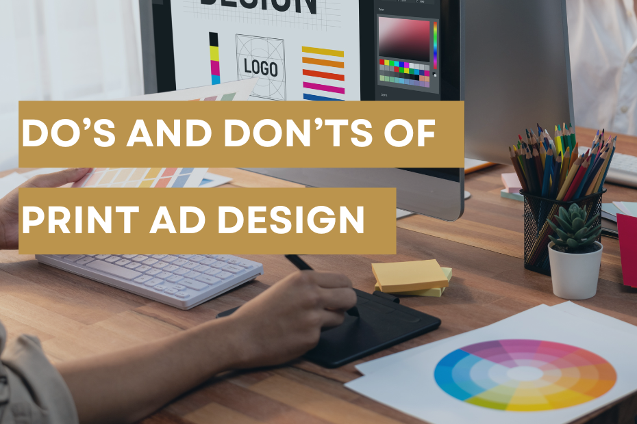
As magazine publishers for more than 25 years, you might say that we’re experts in print advertising –– and our design department knows a thing or two about creating compelling ads.
Creating an effective print ad requires a blend of creativity, clarity and strategic planning. To ensure your ad captures attention and delivers your message effectively, consider the following do’s and don’ts.
DO:
- Have a goal.
Build new business, promote a certain product or service, reinforce brand recognition, advertise an event. - Keep it simple.
Less is more – one main idea, strong imagery, limited text. - Follow a proper hierarchy.
People read top to bottom, left to right. Readers should know what they need to read first without missing any details. - Have a Call To Action (CTA).
What do you want the reader to do? Lead them to a desired action. - Know your audience.
Use words and images that will attract your target audience. - Align with brand consistency.
Use consistent colors, fonts and images across all your marketing materials to establish your brand. - Proofread.
Proofread and have a fresh set of eyes read your ad as well. A misspelled word could cost you a client. - Use white space.
While you may want to fill the page, white space can help create a focal point on what you want the reader to know. It also keeps the page uncluttered. - Create contrast.
Make sure there is enough contrast between text and background for readability. - Research.
Review the publication you will be in to see what other advisers are doing. Look at other ads and see which ones catch your attention and why.
DON’T:
- Use too many words, fonts and/or colors.
Using too many of one or all of these can lead to a cluttered ad that is too much for the reader to understand. - Use words over a busy image.
Again, if the reader can’t see the words over a photo, they will skip over it. - Overclutter the design with too many elements.
Including too much in an ad can overwhelm the reader. - Use images or logos without permission.
Using photos, illustrations, logos, etc. without permission from the creator could lead to fines and criminal charges. - Use low-res images.
300 dpi is recommended for print, 72 dpi for web. A 72 dpi image in print will likely be blurry. - Make it all about you.
While you are important, having that information on your website is better. Use your ad to tell advertisers how using your product or service can benefit them. - Include excessive information.
Trying to load the ad with everything about your company and what you offer can lose the client. - Ignore size dimensions.
Every printed piece has its own dimensions. To avoid having to redesign it, pay attention to the size your ad needs to be, how far text needs to be from the trim and the bleed dimensions (if you want artwork to extend to the edge of the page). - Jump on what is trending.
If the trend doesn’t fit your brand or audience, don’t do it. - Change your logo.
Your logo establishes your brand. While you may have several variations of it, don’t completely alter it or change the color of it to fit a one-time need. You should build your ad around your brand.